The Not So Big Bungalow: A Kit House Made with SIPs (Part 2 of 4 — Main Level)
This post is Part 2 of a 4-part series on the Not So Big Bungalow. If you haven’t already read the previous installment, Part 1 — Introduction, I would recommend doing so first, before reading below.
Designed for Practicality and Comfort
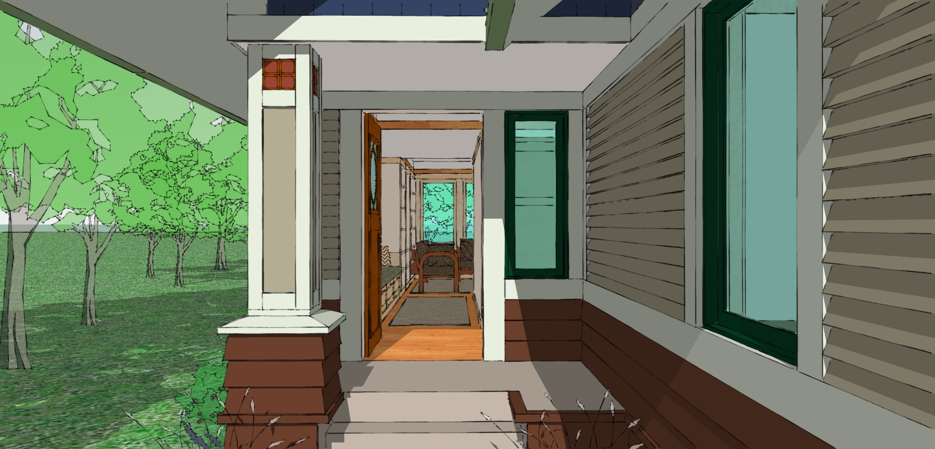
The Not So Big Bungalow is 1,600 square feet, and employs some of the same sensible strategies as its century-old counterpart. Since the master bedroom and bathroom are on the main level, the house can expand and contract with the household’s needs over a lifetime, just as the original bungalows did.
You might choose to finish only the main level to start with, then finish the second floor as kids come along, and return to one story living in later years, leaving the upper level for visiting family and friends. It’s designed to be both beautiful and functional, and to inspire its inhabitants every day.
Below, using images of the Bungalow, I describe some of the key Not So Big principles that were applied in its design. Each design principle (shown in bold type) links to an ideabook on Houzz that further explores the principle, and is followed by some tips on how to incorporate the principle into your own dwelling. (For a full dictionary of Not So Big principles, check out my fourth book, Home By Design.)
The Main Level Floor Plan
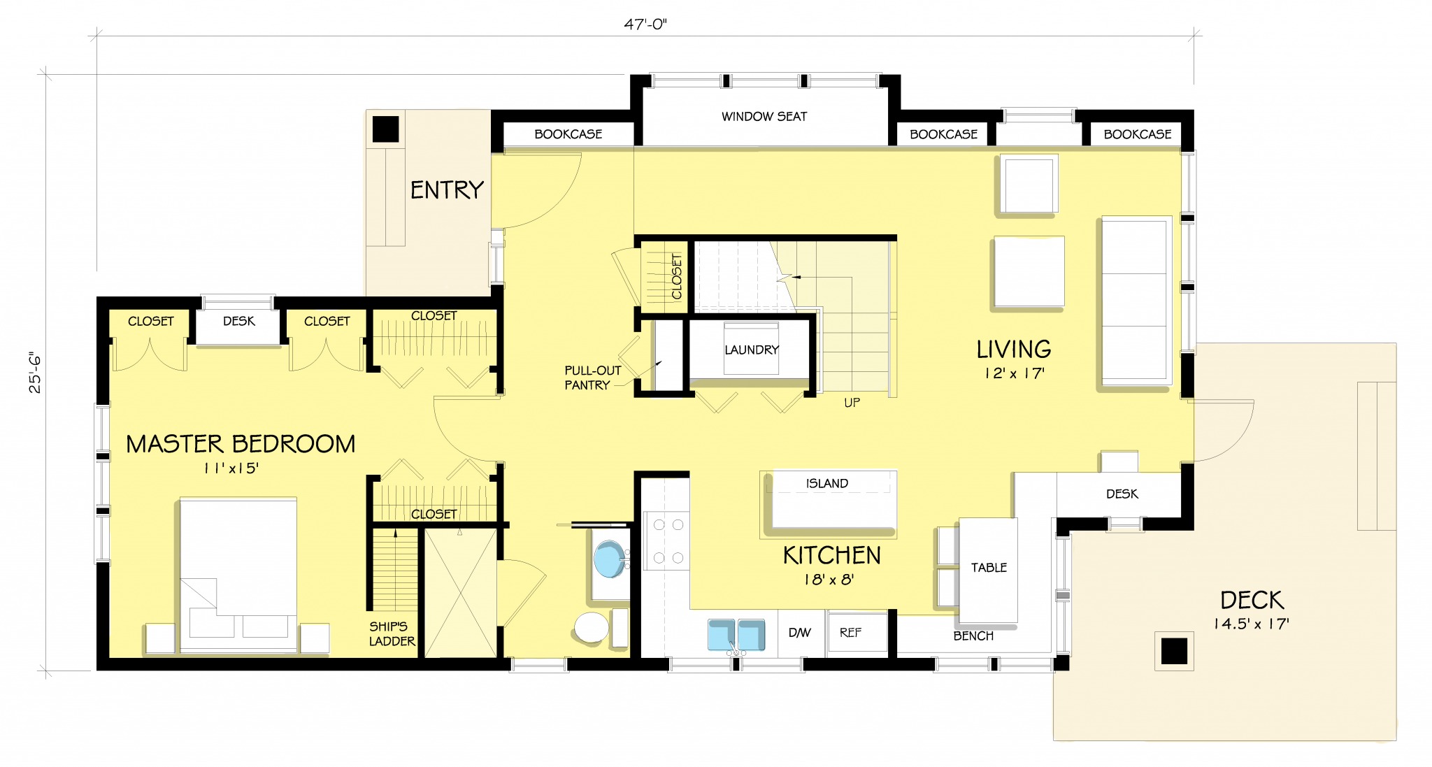
The Main Level is 960 square feet in size, and designed for one level living, if needed. It includes a spacious kitchen, which opens to living and dining areas that serve both formal and informal functions.
The layout of these three rooms is similar in layout to my original Not So Big House Prototype, which you can see illustrated throughout The Not So Big House (for example, see pp. 41, 42, and 44).
The Entryway
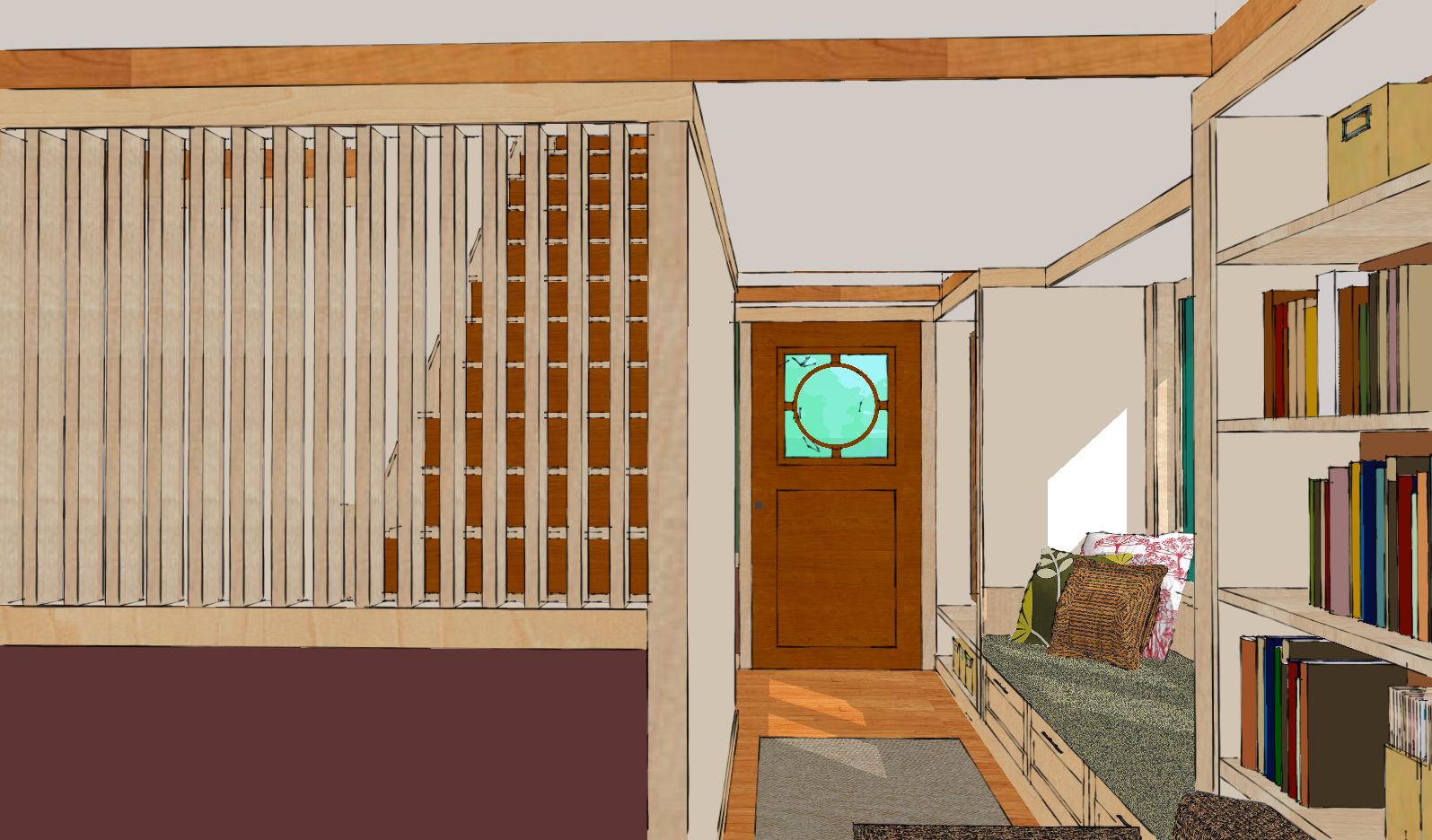
The specially designed front door of this house provides a personal and unique touch, and emphasizes the sense of arrival during the Process of Entering.
The passageway into the living room includes a comfortable window seat, which can also serve as a quiet place to read or look out into the garden.
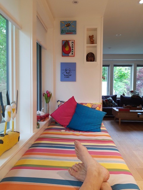
A Not So Big Bungalow window seat (Toronto Island)
Not So Big Tip: You can make your own entry more welcoming by creating a place to stand and catch a glimpse of the living space. This welcomes you in, allows you to shift from the more public persona of the outside world, to the more private persona of this inside world, and if you are a guest, encourages you to keep exploring.
The Living Room
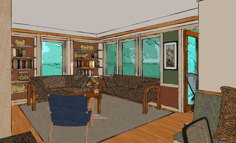
This room is the primary living space in the house. It is open to the dining area and kitchen, so whether you are entertaining or hanging out with family, conversation is easy. Note that one wall of the room is lined with shelves, and a surrounding trim band tricks the eye into believing the room is taller than it actually is. Paint colors also add to the personality of the space.
Not So Big Tip: If you have a lower ceiling, by adding a Continuous Trim Band (or even a painted line, if money is tight) at the height of the tallest door, and painting the area below this line a different color than the area above, you’ll transform the space from squashed and boring to spacious and charming.
The Dining Area
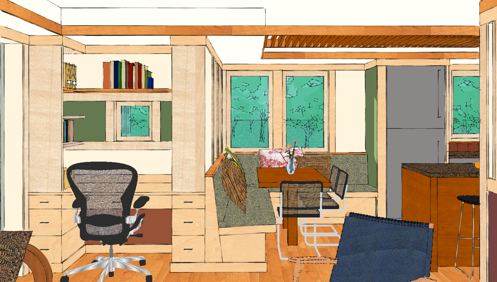
Like the adjacent living room, the dining area is designed to Do Double Duty. It is perfect for everyday living, but when guests come over, the space is also suitable for a more formal meal.
Not So Big Tip: If you have two dining spaces, consider turning the more formal one into something else (an in-home office, an extra sitting space, or a hobby room) and make the more informal eating area more inviting, by investing in a better table, or dressing up your existing one. This is where you spend quite a bit of time. Make it a place you love, and your guests will love it too.
The Kitchen
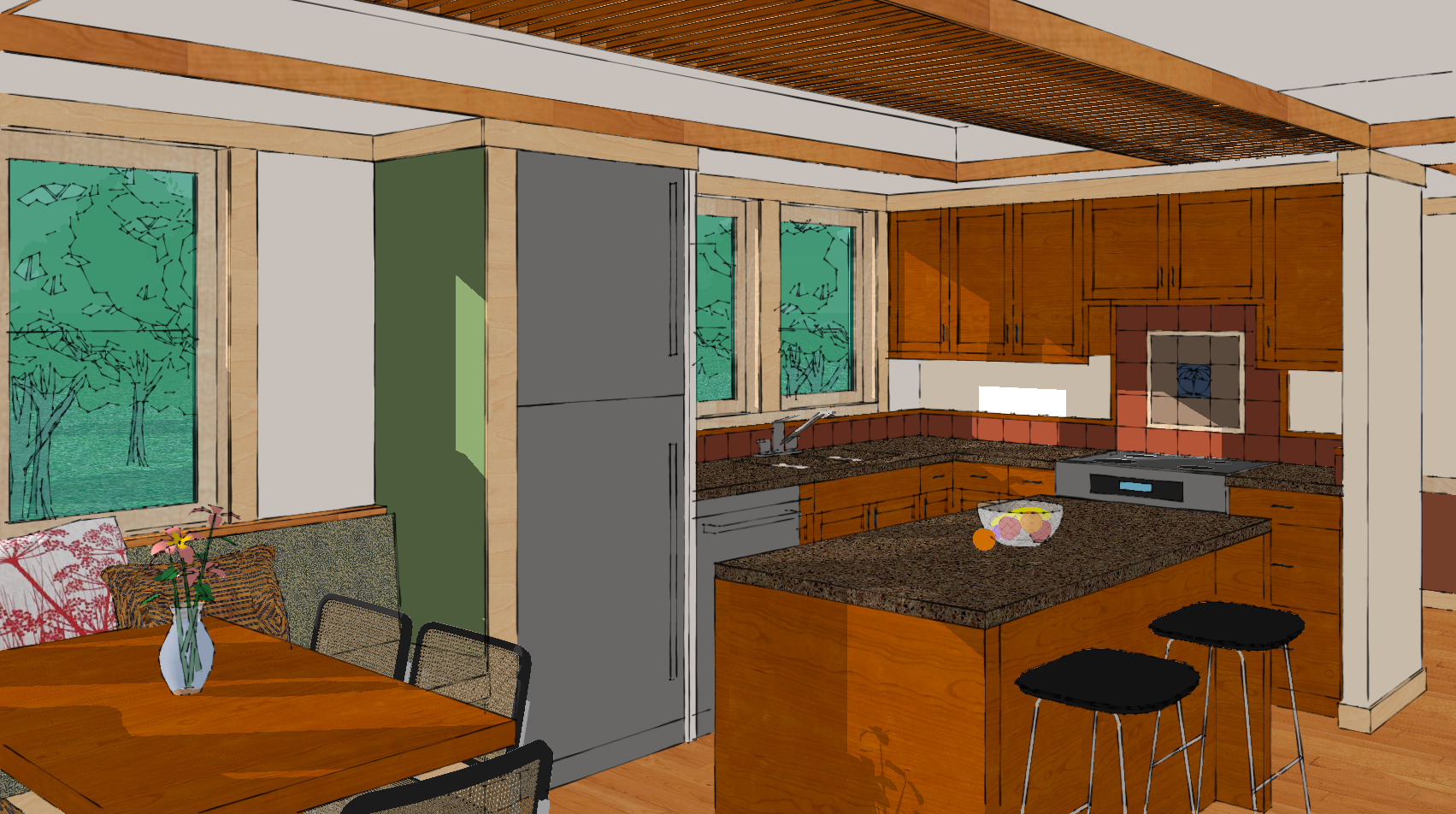
This room is visually connected to the living area, but is differentiated from it by Varying the Ceiling Height with a horizontal trellis that extends across the space, above the kitchen island.
Not So Big Tip: If you have an enclosed kitchen that’s isolated from the main living areas, consider creating an opening in the wall between the two, so that you can Connect the Views and see from one to the other with ease. This simple remodel will make your place feel twice the size.
The Master Bedroom
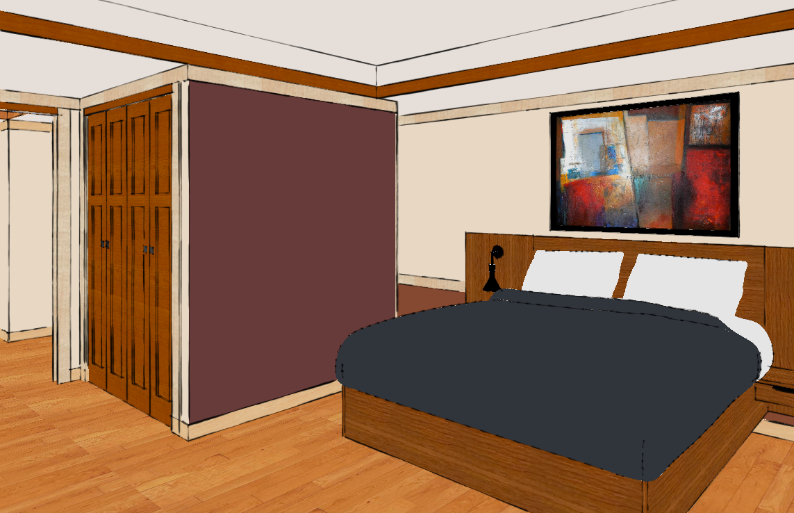
This room is located on the main level, at the opposite end of the house from the living room. It has Ample Storage and Built-ins, minimizing the need for additional furniture. There’s a dropped ceiling above the bed that creates a sense of shelter for the bed-another example of Ceiling Height Variety. Tucked away behind the maroon colored wall is a ship’s ladder to a loft above.
Not So Big Tip: Some bedrooms are hard to get comfortable in because the wall behind the bed is really tall. You can add a dropped ceiling, or create the same effect with fabric draped over utility shelf or L brackets, to lend a sense of shelter to the bed below.
The Back Deck
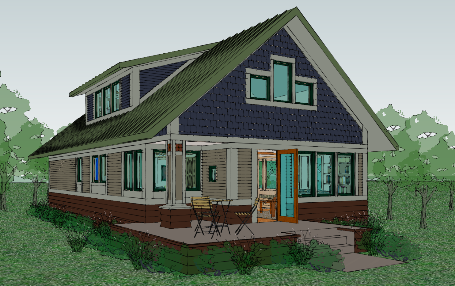 A door from the living room opens out onto a small sitting space. If it’s raining, you can pull your chairs under the corner overhang and watch the storm from this cozy and protected spot. This is a version of the covered deck in the original Not So Big House, which was one of my favorite places to sit in the evenings to watch the sunset.
How to Order the Plans and SIPs Kit
The house plans for the Not So Big Bungalow are highly detailed, and delineate all the “Not So Big” features and characteristics that I explain in my books. The SIPs kit provides all the parts required to create the structural and thermal building envelope (all the parts that make the building stand up and keep the inside insulated from the outside), except for the doors and windows.
Although the plans and kit are sold separately, both are needed in order to build the house. Click on the separate links below for more details, and for ordering information.
The Not So Big Bungalow SIPs Kit
Next Up…
Go to Part 3 — Upper Level, to continue the tour.


