Not So Big Showhouses:
Libertyville Not So Big Showhouse
Build Better Not Bigger
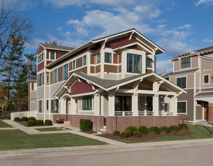
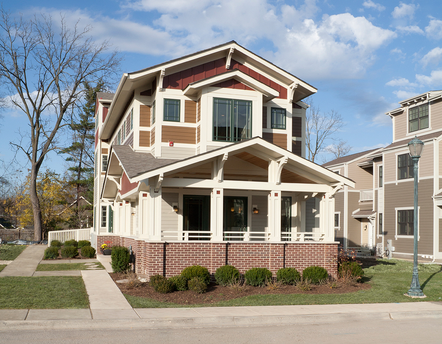
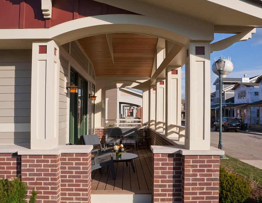
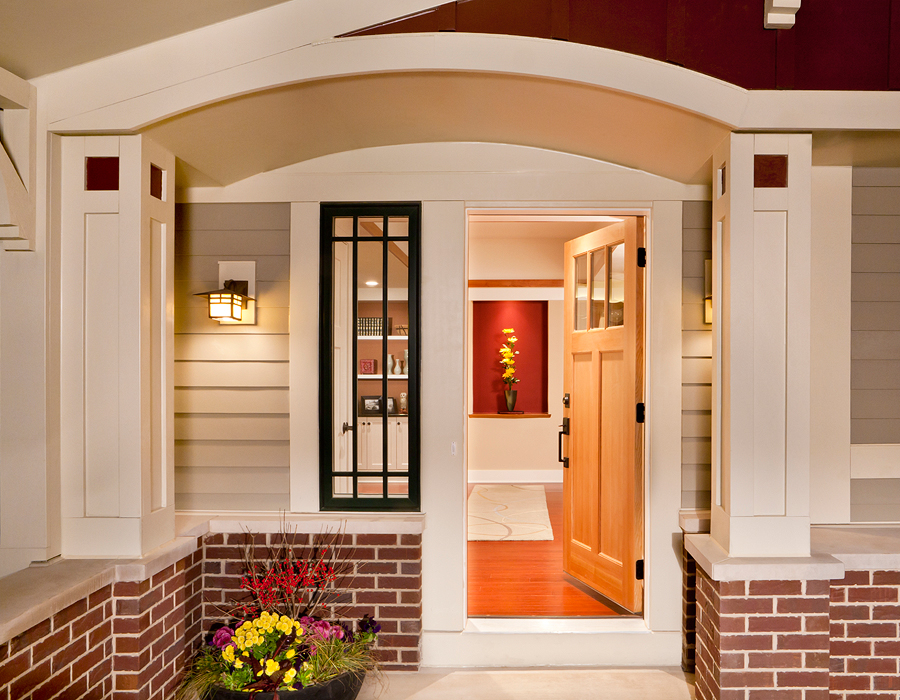
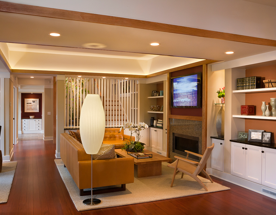
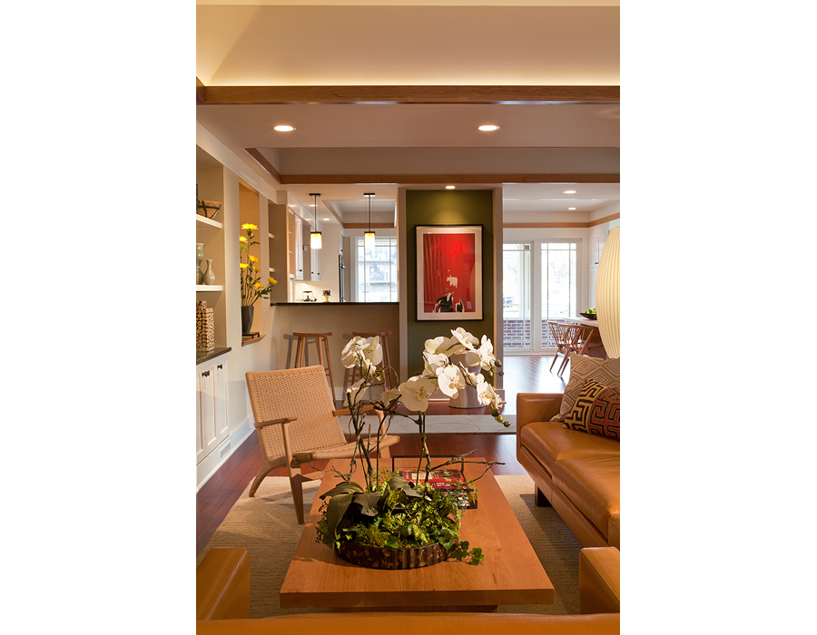
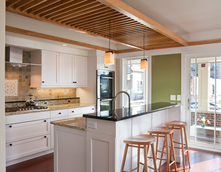
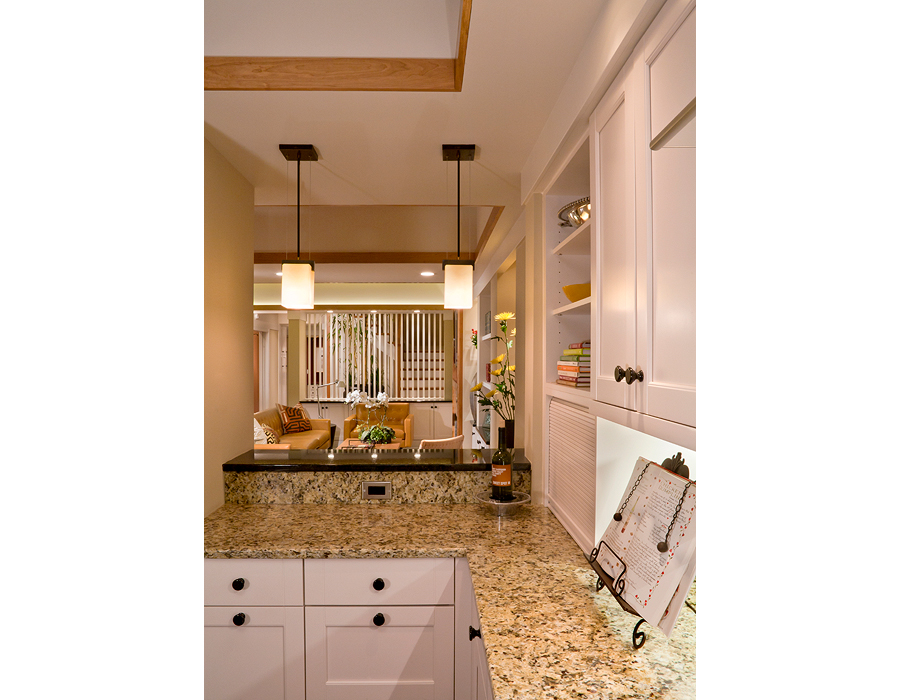
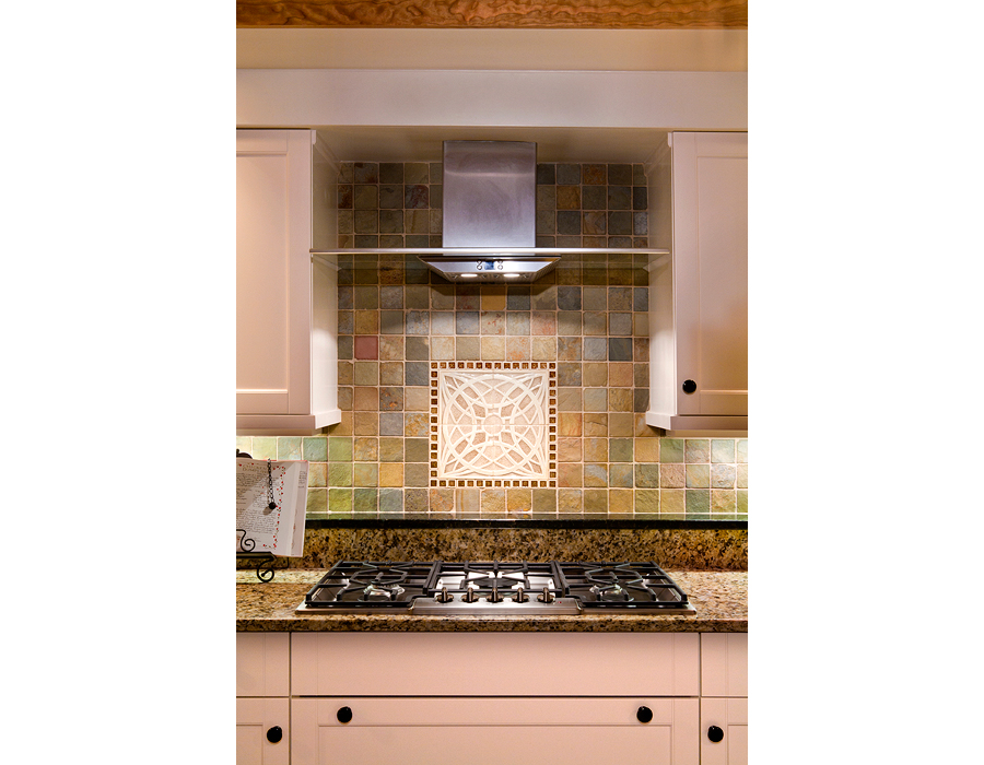
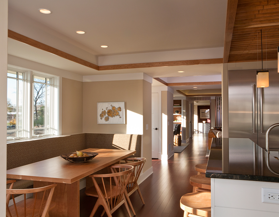
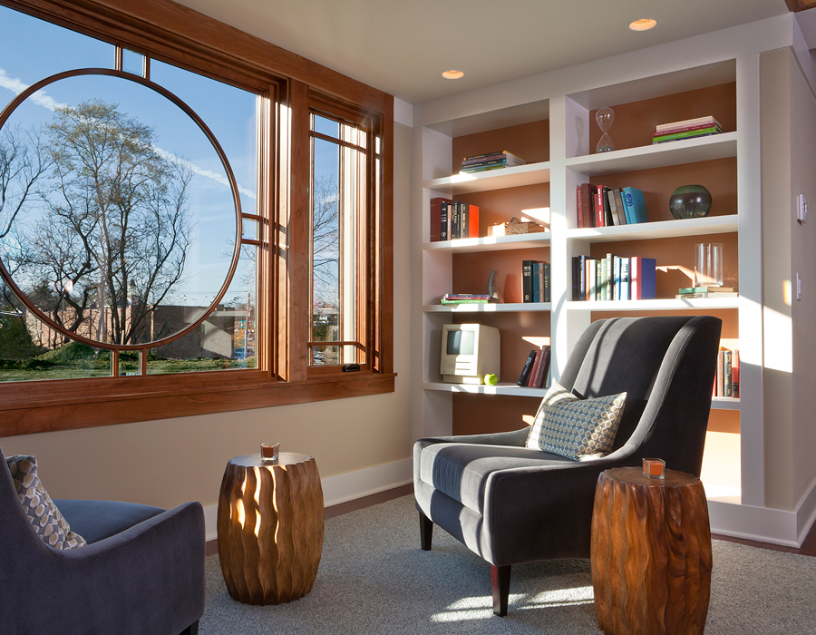
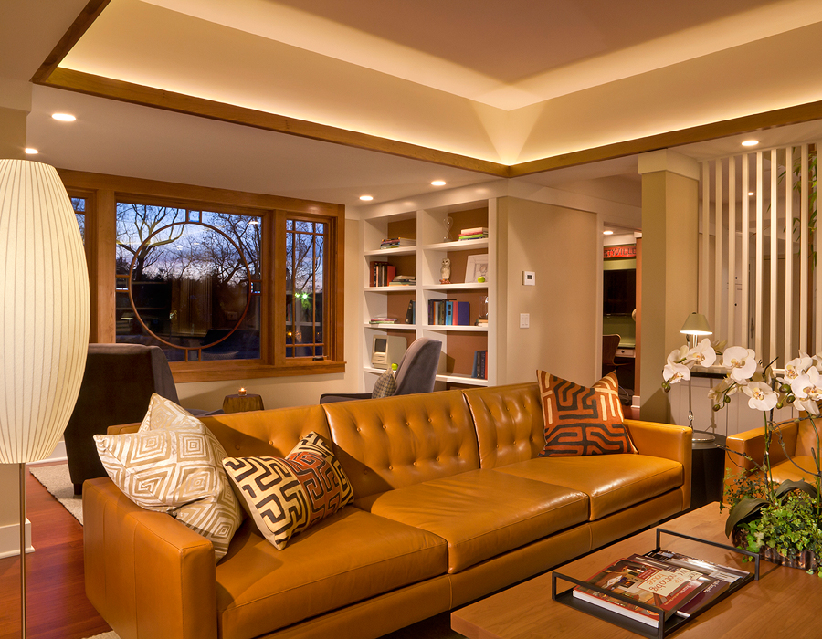
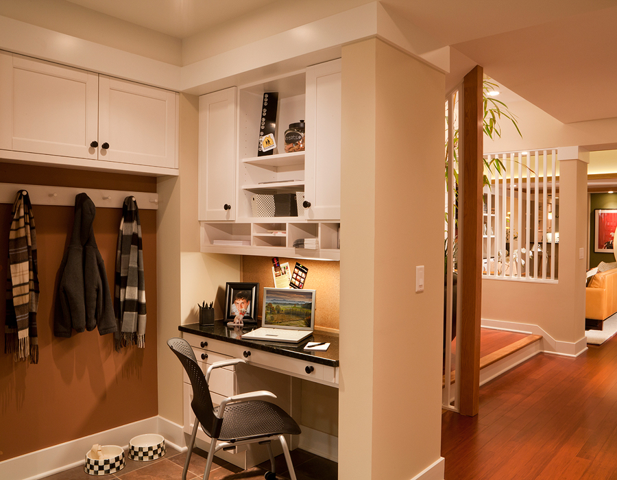
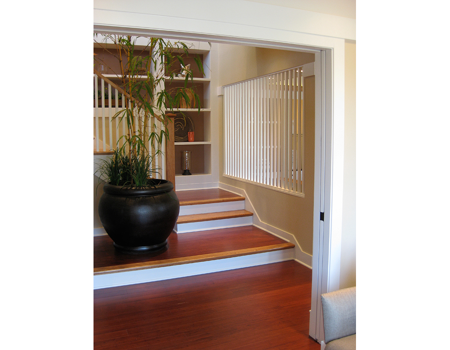
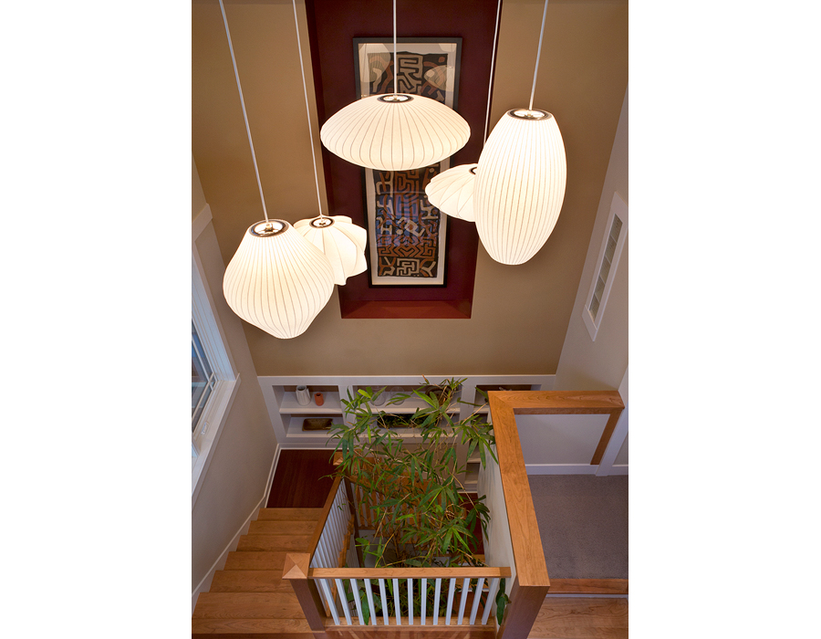
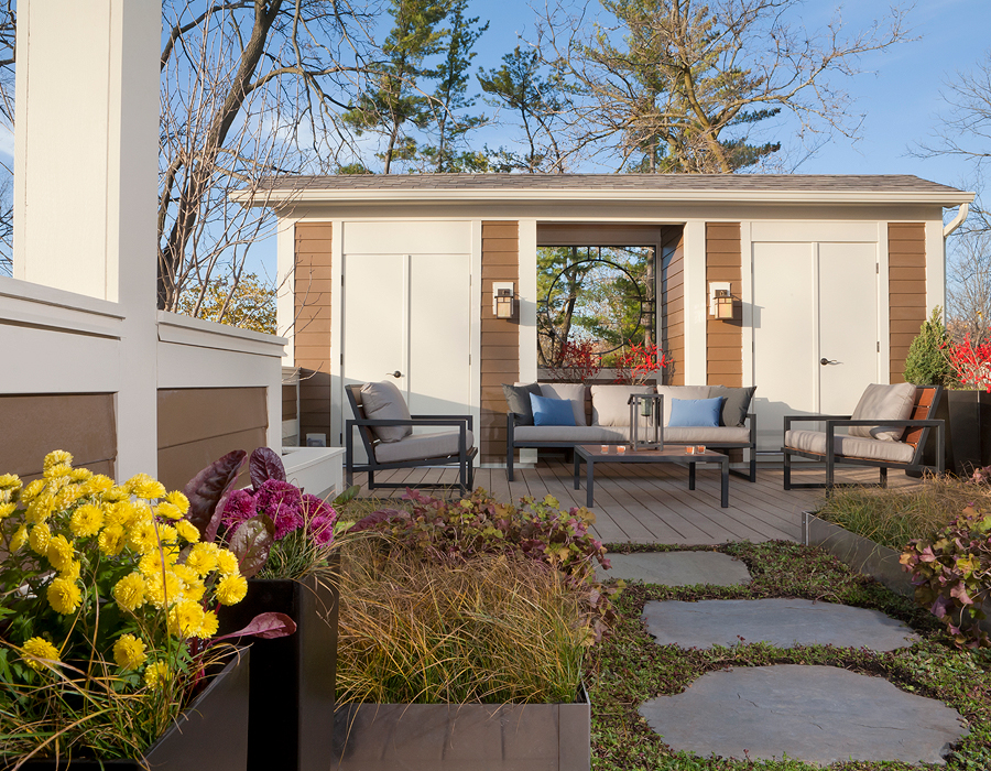
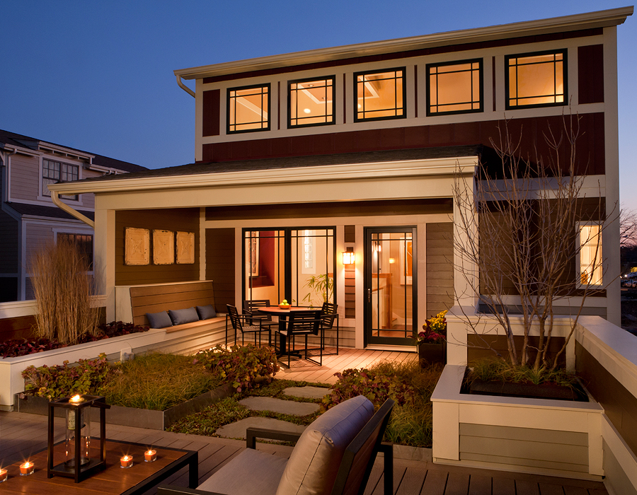
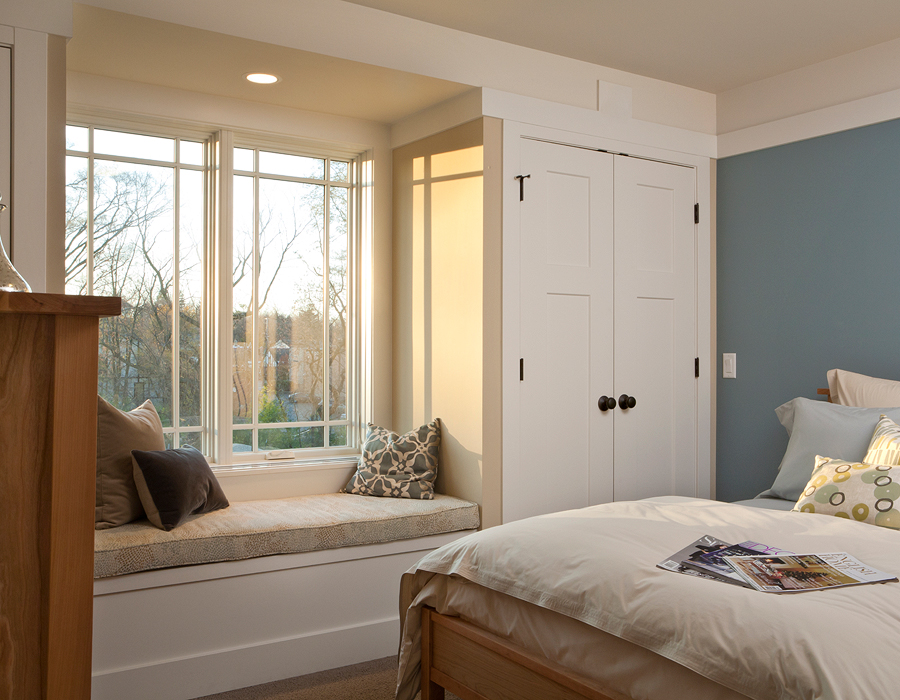
Sarah Susanka’s Libertyville Not So Big Showhouse at School Street brought her ‘build better, not bigger’ design principles to a well-thought-out neighborhood urban infill project in the vibrant existing village of Libertyville, Illinois, just north of Chicago. While the home is now privately owned, more than 8,000 people, from all over the country, have visited the Showhouse.
Photos by Barry Rustin, © Susanka Studios, Inc.
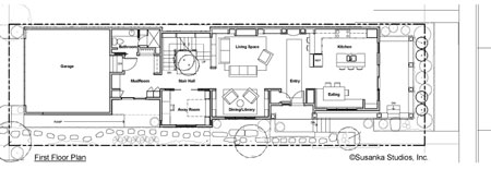
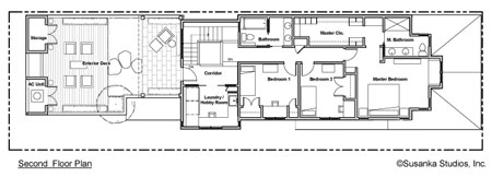
Libertyville Not So Big Showhouse Plans
Libertyville Not So Big Showhouse Videos
Part 1 of 4: ENTERING THE HOME
Sarah welcomes the viewer inside the Not So Big Showhouse, and demonstrates how she has used the principles of “Light to Walk Toward” and “Ceiling Height Variety” to define spaces without the use of walls.
Part 2 of 4: LIVING AREA AND KITCHEN
Sarah describes the application of a number of Not So Big design principles within the main level of the Not So Big Showhouse. “Wall Thickness” provides personality for a windowless wall. A “Point of Focus” gives the kitchen a center. “Differentiation of Parts” is accomplished through trim bands, soffits, color and lighting. And a “Theme and Variations” is repeated pattern that ties the house together visually.
Part 3 of 4: AWAY ROOM AND DOWNSTAIRS BATH
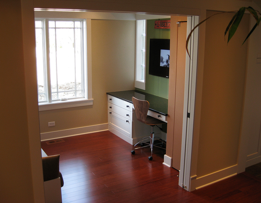
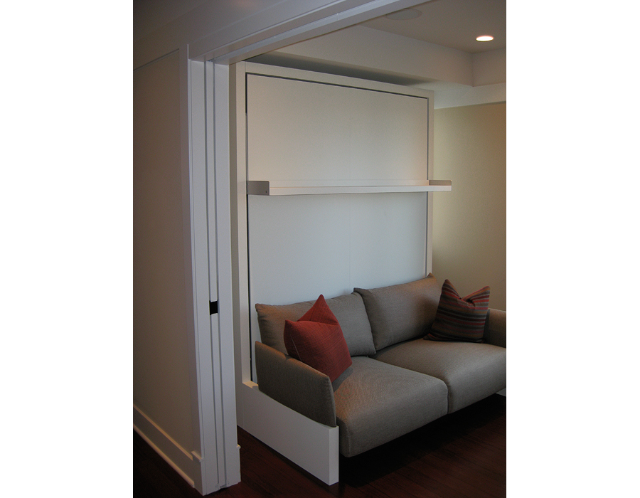
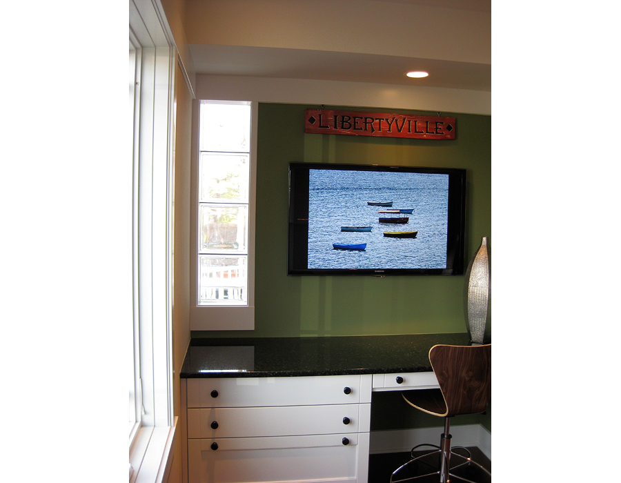
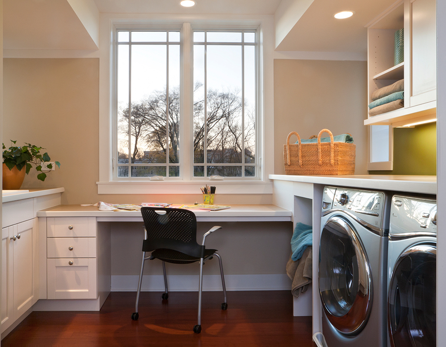
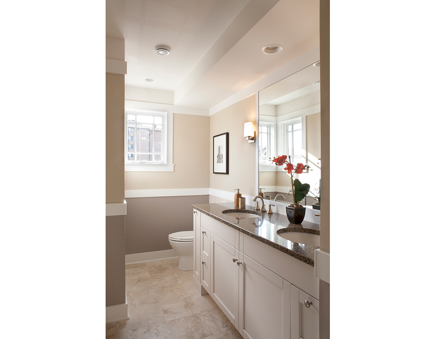
In the Not So Big Showhouse several rooms do “Double Duty”—a key strategy for reducing the square footage of a home. Sarah demonstrates how this strategy is applied in three spaces: the Away Room, the Main Level Bath, and the Laundry Room. Since the house sits on a narrow lot that will eventually include adjacent homes, Sarah also shows how natural light is brought into the center of the home in a unique way.
Part 4 of 4: UPSTAIRS BEDROOMS AND BATHS
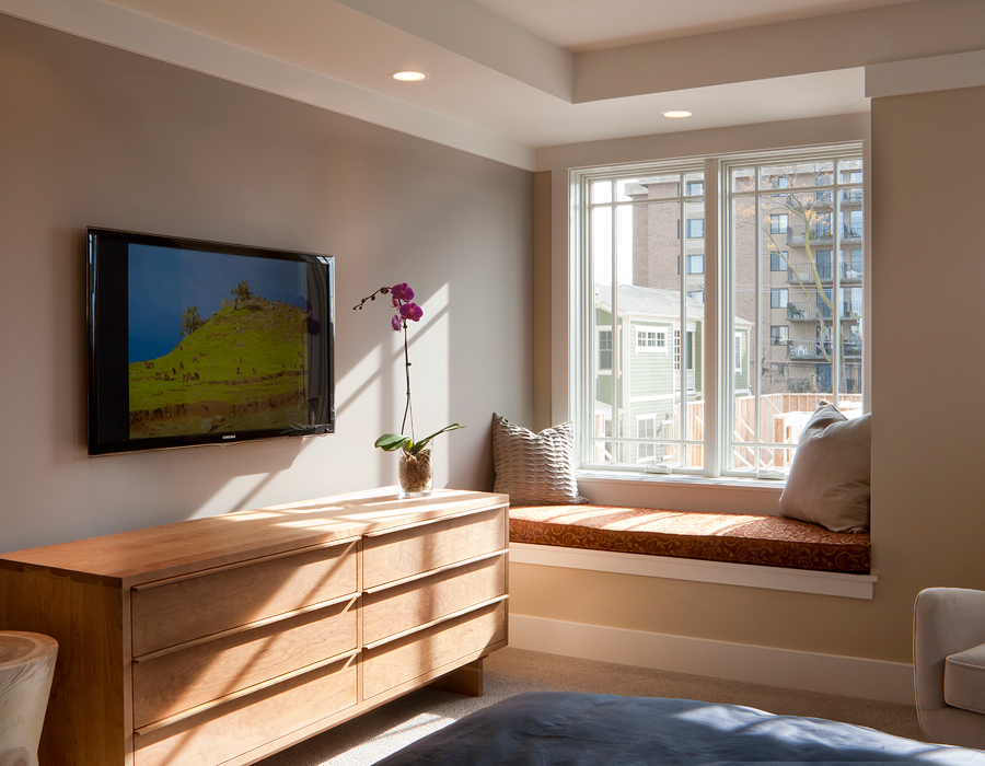
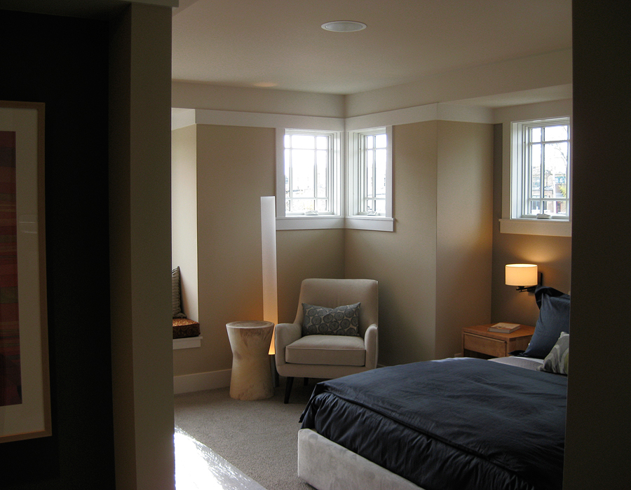
Sarah demonstrates the use of several Not So Big design principles on the second floor, such as “Visual Weight,” “Making Less feel like More,” “Ceiling Height Variety,” and “Window Seats,” to create spaces that are intimate yet practical, and proportioned for the way we really live.
